Johnson & Johnson | BAND-AID
How an everyday consumer product impacts representation.
Johnson & Johnson’s BAND-AID® has been in the wound care business for over 100 years and is one of the most recognized brands in the consumer care category.
In 2020, amidst the Black Lives Matter movement, BAND-AID® took to social media to announce the release of a new multi-tone Band-Aid. Despite there being a tremendous need for a product like this, there was significant backlash to BAND-AID®’s announcement resulting in the company taking a pause and realizing they needed to rethink the strategy, brand and launch plan to be more intentional and purposeful.
The Challenge
We knew that launching a multi-tone adhesive wasn’t just about a band-aid. It was about the history of people of color who have consistently felt under represented and ignored by institutions of power and the systems that surround them including products that did not acknowledge their diversity. And this everyday product had the ability to either reinforce those negative feelings or act as validation, representation and a reason to celebrate.
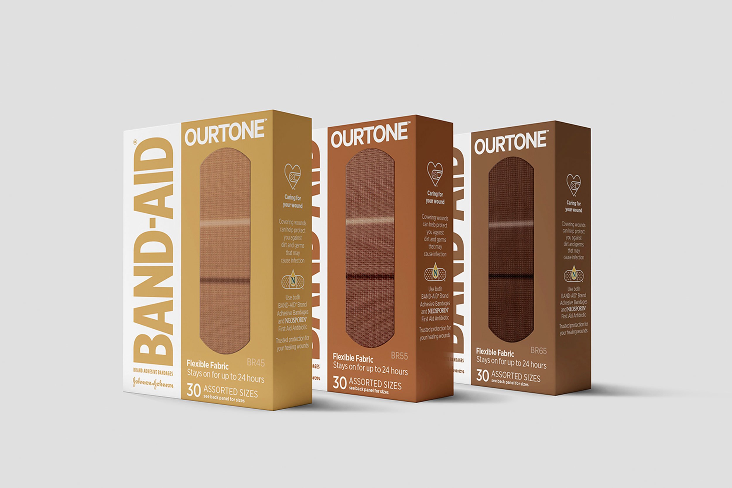
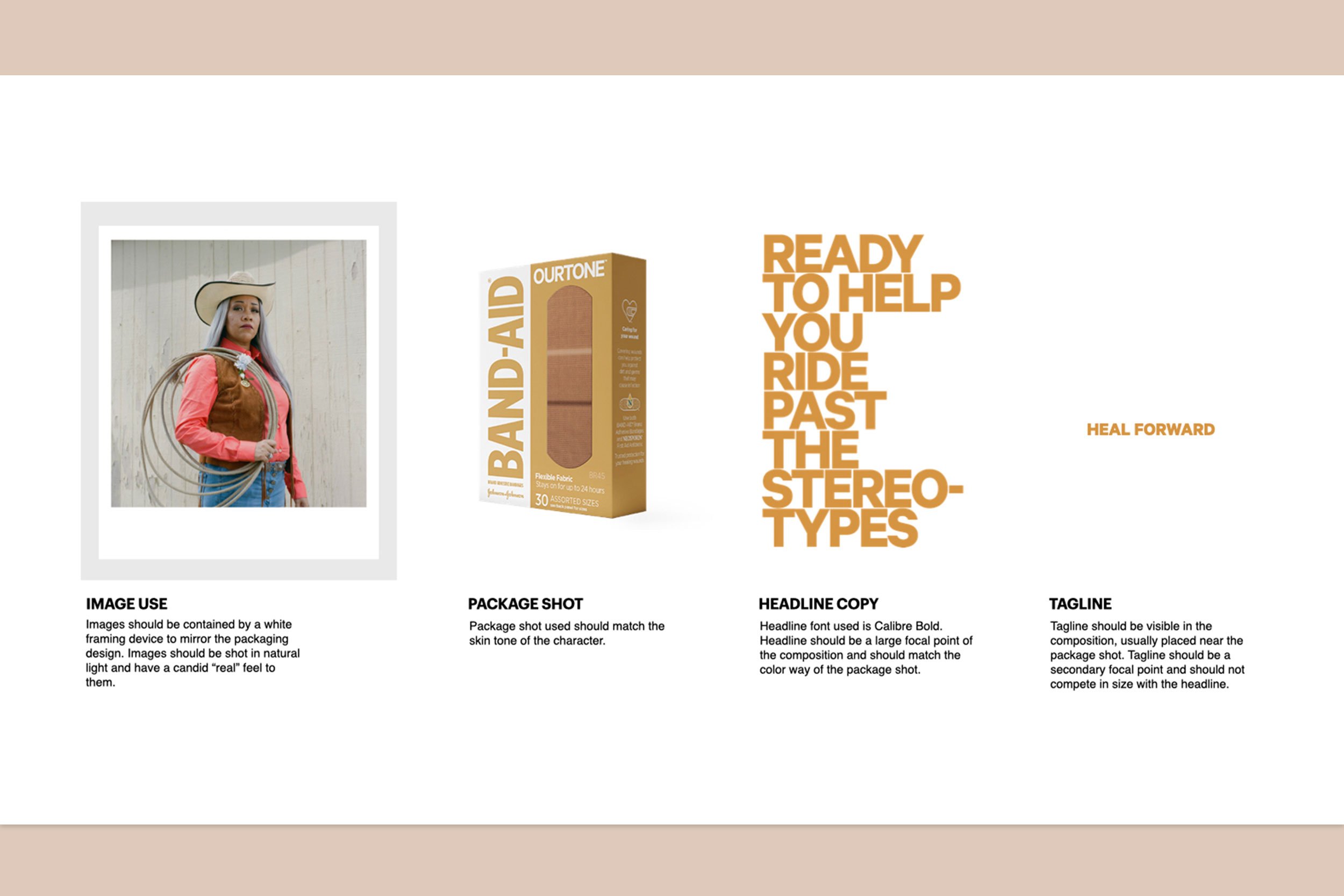
The brand OURTONE was built keeping those principles in mind. Everything from the brand name, the naming convention of the shades (BR45, BR55 and BR65), the details on the packaging and the launch campaign was meant as a celebration of the BIPOC community which has had a history of tremendous resilience; falling down but always getting back up. We wanted the packaging to stand out clearly and so we led with color rather than having it be a smaller part of the design language. The packaging had a striking, bold feel to it. We even negotiated for special permission from the brand to use the Band-Aid logo in colors corresponding to the color in the box.
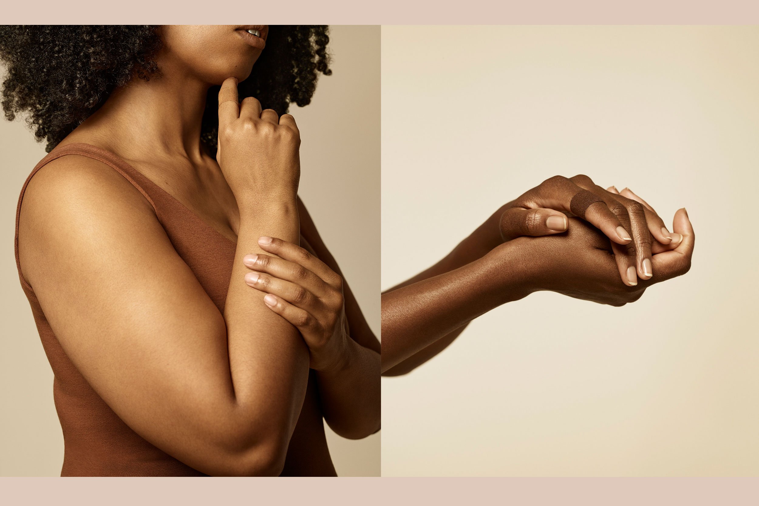
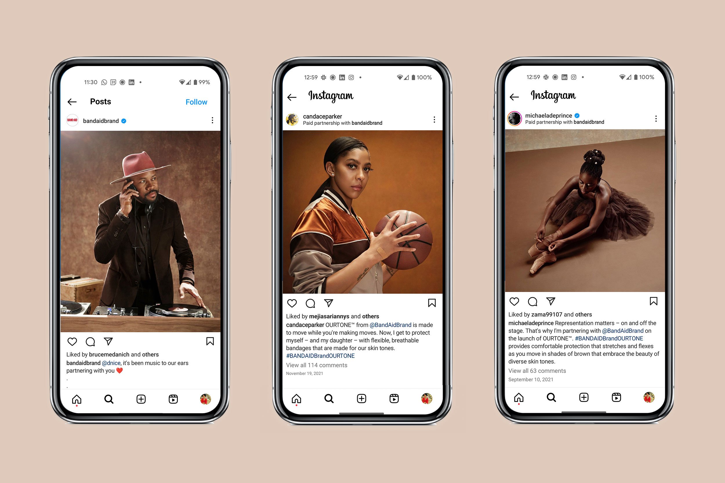
The photoshoot of the product was the next stage, we treated it like a beauty campaign and focused on the product on skin versus traditional wound care photography. The result was a set of images that stood in their category, felt thoughtful and intentional.
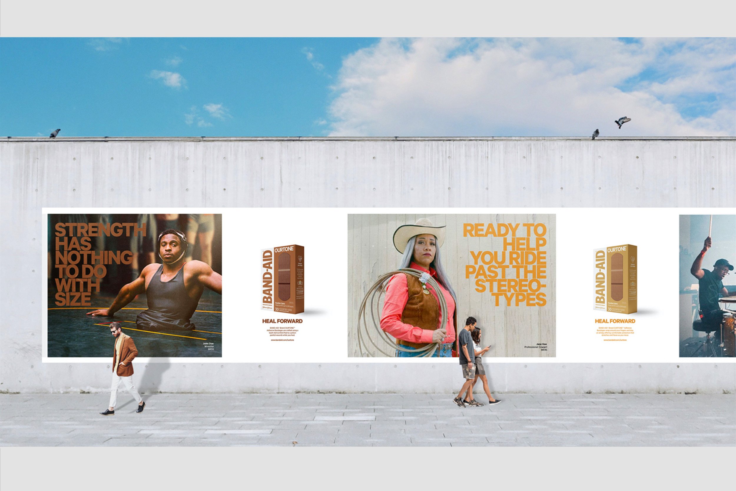
We then moved on to the campaign launch which would consist of 3 celebrity videos. We chose to work with artists who had a story to tell, a journey of ups and downs and perseverance. We worked with DJ D-Nice from Club Quarantine, WNBA Player Candace Parker and renown ballerina Michaela DePrince. Each brought their own journey to the brand story. This resulted in assets for video, social and stills.
The Solution
The work done on OURTONE launched to extremely positive sentiment, an increase in purchase intent and a shift in the way the brand had historically been seen. The sentiment ranged from the appreciation of the option of a multi tone solution to emotional celebration, validation and an acknowledgement of being seen. Since launched on social the campaign has had over 127M+ impressions, 16M+ in unique social reach, the view through rate has increased 3 times and the frequency 8 times. The result of a brand lift study concluded that the brand OURTONE had received the highest brand recall and consideration in recent history.
Outcomes
Accountable For:
Account Lead
Project Management
Creative Direction
Packaging
Art Direction
Pre-Production
Deliverables
Brand Strategy
Brand Development
Naming
Packaging Design
Launch Strategy
Campaign Development
Social Media and Influencer Strategy